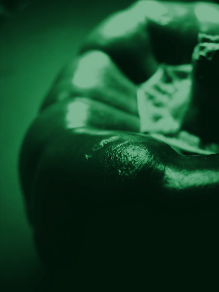
Green Pepper
 This shot is somewhat of a tribute to the great photographer, Edward Weston. Some of Weston's more famous shots are simple black and white photos of bell peppers which look almost like human forms.
I first shot this bell pepper in black and white with a shallow depth of field and a high level of contrast. Then I bumped up the saturation and contrast even more in order to get an even more dramatic look using the gimp image editor. Finally I used a dark green tint similar to the color of a real pepper and applied it to the whole image.
I'm pretty happy with the end result as it one of the first 'post processed' images I've done.
Nikon Coolpix 5400, AV f3.5
[click photo to enlarge]


14 Comments:
I like it, especially if it was part of a series with different color tints. The only things i would change are a greater depth of field so the stem has more details, and crop the distracting top left corner
I really like the high contrast between the fine details in the foreground with the DOF in back. Great work.
Thats really neat and creative, too! I also agree with Ian's point of putting the stem in focus (but thats not a huge deal for me).
Very nice. I wouldn't have initially guessed that you added in the green tint afterwards. Like Ian suggested, it would be interesting to see this as part of a triptych, maybe, with 3 color tones for each image, maybe green, red, and yellow-orange. Good job.
Hello Ahamed...this is my first visit to you page and I am VERY umpressed with your photos! You have some very creative content and I will definately be a regulr visitor.
About this green pepper. I think you did a fantastic job...the colour choice is dead on and I think your point of focus is ideal...the detail on the rounded skin of the pepper is more interesting than a focused stem. Just my 2 cents worth! :o)
Keep up the great work. Will be back again soon.
great job on coloring this
Thanks for the comments,
I avoided focusing on the stem because that seems like the dominant detail anyway. I wanted to bring out the detail in the 'skin' of the pepper like d macintyre said.
And a triptych or a series is a good idea, I'll put that on my to do list.
Tena koe ehoa
Thanks for dropping by "nativ flavaz" and commenting. Your image of "Green Pepper" is very interesting. I'd tend to agree with comments that it could be utilised in a series.
That is a gorgeous green. Good job on the work you did for this one.
I like the way you framed this pepper. I have no problem with the part you focused on. I think it works well with the soft DOF. A focus on the stem would give you a total different result which wouldn't be as nice. The green color is well choosen and I agree with the others that a yellow, red, green triptych would be nice!
Thanks for the comments.
I think the red green and yellow idea would work very well, I might give it a shot tonight...
looks tasty!
I like the overall green tone of this image. also, nice header photo of your blog. Its os beautiful to look at.
Thanks for the comments,
Brocco- I actually ate the pepper about 5 minutes after taking the photo, and yes it was tasty.
Estan- thanks for noticing the header, I am very happy with how it turned out. To see that original image, check out this link...
http://ahamediqbal.blogspot.com
/2005/10/rolling-hills.html
Post a Comment
<< Home